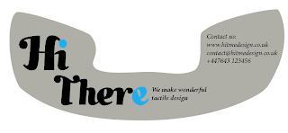
First of all decided to add some of the informality of the round business card I did, exact same language. Typeface still lacking, I think it was Champagne & Limousines..

Slight change of language, still informal I think. Made 'there' the same 'typeface' as HitMe logo, changed other typeface to Minion Pro Bold Italic.
So here it is with the original telephone idea.
Or I'm thinking that a lot of people may not get the thing behind 'hit me up' so changed it to say 'Hi there' on the front instead, and HitMe on the back. I'm not really sure where to take it now, or if you guys are even that interested in the idea so feedback would be great.


I think the best of the designs is the one 2nd from bottom. Really like how you've gotten the "Hi There" in the same typeface as the logo, also it makes sense what you were saying about people not necessarily understanding the "Hit Me Up" aspect and I think that "Hi There" still has the same message and has the same approachable feel. I think the back of the business card works best in just a plain grey, it makes the type easier to read and allows the detail on the front to be the main focus. I do also really like the typeface used on the back of the card, I think it goes with the HitMe type really well.
ReplyDeleteI really really like this as a business card style, would definitely work and be something different!